 Looking for information on how much of the traffic to your website comes in via mobile devices? This is one of the basic default reports that Google Analytics offers, and it’s easy to find. Just follow these steps.
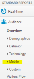
- Under Standard Reports (on the left-side navigation), click on the Mobile link (shown at the right).
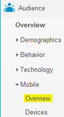
- The menu will expand, and you’ll see two mobile options: Overview and Devices.
- IF you’re looking specifically for information about what mobile devices people are using to visit your website, use the Devices link. (Here are details on how to pair this mobile device info up with screen resolution.)
 But if you’re looking for a higher-level view of your mobile traffic – the sheer volume of it, how it compares with your desktop traffic, and the breakdown between tablet and smartphone traffic – click on the Overview link.
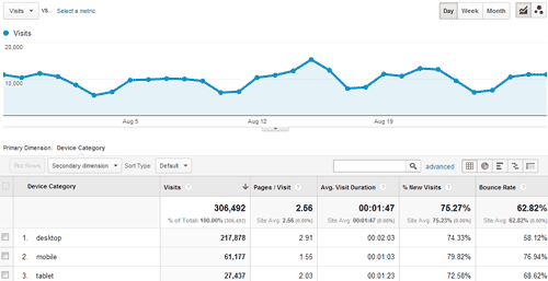
Here’s what that mobile report will look like:
You can use the Secondary dimension dropdown to add information about screen resolution, operating system, support for java, or even audience geography, referrers, and a whole lot more. (If you’ve never used the Secondary dimension feature, take a look at it. You’re missing out!)
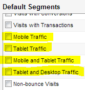
 If you want to see a mobile breakout in other Google Analytics reports, you can use advanced segments for that. There are several default segments already set up related to mobile traffic, as shown here to the right.
How have you used mobile reporting to help improve your website? Please share in the comments section.

