[tweetthis hidden_hashtags=”#analytics”]Want to know what screen resolution your #mobile website visitors are using?[/tweetthis]
Want to know what screen resolution your mobile site visitors are using when they visit your website?
This is basic information that should be available in any decent analytics package, and it’s very easy to find in Google Analytics.
Here’s how:
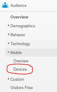
- Start in Standard Reporting. In the Audience section of the left menu, expand the Mobile dropdown menu, and click on Devices.

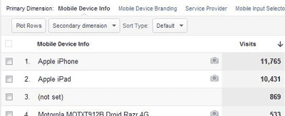
- The report you see should look something like this:

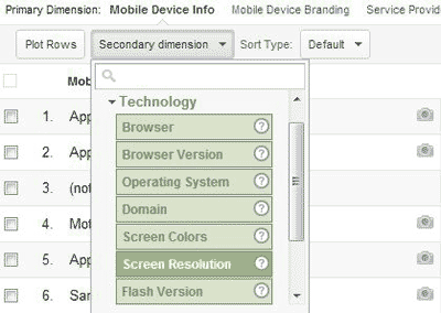
- Use the Secondary Dimension dropdown menu to add screen resolution information to the report. You’ll find screen resolution in the Technology section under Secondary Dimension:

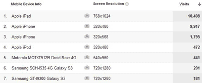
- Now you have a report that shows you both what mobile devices your visitors use, and at what screen resolution those devices display.

What are you going to use this for? Well, among other things, determining whether you need a specific version of your website optimized for tablet users. More on that in a post tomorrow.

Great post. But how do you get which iPhone versions are being used on the site? Is that possible?
Great question! This is actually one of the use cases for knowing how to pair up device and screen resolution, because the specific model of iPhone is not available directly in Google Analytics. Because all iPhones lump together under the device name Apple iPhone, you need to look at screen resolution to know which devices are being used. Apple’s marketing information gives the specific screen resolutions for all of their current phone models (iPhone 6 Plus, 6, 5s and 5c), which fortunately are all different. I double-checked Wikipedia to confirm screen resolution for the iPhone 4. Here’s the screen resolution that equates to each model:
iPhone 6 Plus: 1920×1080-pixel resolution at 401 ppi (pixels per inch)
iPhone 6: 1334×750-pixel resolution at 326 ppi
iPhone 5s: 1136×640-pixel resolution at 326 ppi
iPhone 5c: 1136×640-pixel resolution at 326 ppi
iPhone 4: 960×640-pixel resolution at 326 ppi
By using a JavaScript like wurfl.js you can utilize the custom dimensions feature in GA to create reports with iOS models. Here is a post explaining the process: http://www.scientiamobile.com/page/wurfljs-google-analytics-iphone
Actually it’s little bit more complicated.
As I find out in Google Analytics you see logical resolution not actual pixel size.
iPhone 4 real pixel screen size is 960×640 pixels but Google Analytics shows it as 320×480.
To know real screen size you need to multiply screen size that Analytics shows you by 2.
Lets take three first devices from las screenshot.
___Device______Analytics size______Actual size______________________
1. Apple iPad 768×1024 x2 1536×2048 (iPad Air, iPad Mini Retina)
2. Apple iPhone 320×480 x2 640×960 (iPhone 4, 4S)
3. Apple iPhone 320×568 x2 640×1136 (iPhone 5, 5C, 5S)
Had the same problem with the new iPhone models.
Eventually I created this table (mapping between Apple’s documented resolution and Google Analytic’s resolution):
http://www.mobilespoon.net/2018/10/mapping-new-iphone-xs-max-and-xr-screen.html